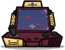
Pixel Pack
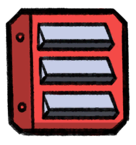
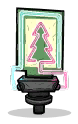
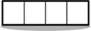
Pixel Pack is a decorative item which has four one-tile-sized squares which can be toggled between two different colors using Automation. Each pixel can be controlled individually using an Automation Ribbon or an Automation Wire: If a Ribbon is used, each bit of the Ribbon's signal controls one corresponding square in the Pixel Pack, whereas if a Wire is used, all squares will be controlled using the Wire's signal.
As a Background Building, it does not occupy the space for purpose of blocking construction of most other buildings (with exception of tiles, doors, and other background buildings).
The colors of each square in each state (on and off) can be customized separately using the Pixel Pack's interface (see pictures): A color can be selected from the palette by clicking, and then applied to a square by clicking the respective square in the desired state row, with the top row for the On state and the bottom row for Off. Additionally, three special function buttons can be used:
- ⯅Copy the "Off" state colors into the "On" state
- 🔁Swap the "Off" and "On" states
- ⯆Copy the "On" state colors into the "Off" state
Tips
Pixel Packs are relatively cheap to build, won't block the space for most other buildings, and provide a high amount of Decor even when disabled. Build them out of gold to increase the decor bonus.
History
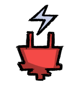
- AP-396529: Pixel Pack consumes power while turned on.
- AP-395929:
- Pixel Pack sidescreen color swatch now highlights what colors are used by the selected Pixel Pack
- Pixel Pack now updates its screens when copy Green State <-> Red State or swapping
- Add a "Swap Colors" button to the Pixel Pack sidescreen.
- Pixel Pack animates while turning on / off.
- Pixel Pack has animation state for "off" now, which doesn't display the selected colours
- Toned down the screen glow effect on the Pixel Pack
- AP-395113: Introduced.


